
My question concerns the ubiquitous hooded man of fantasy-cover-land.

When reading a book does it upset you to have the face of the main protagonist eyeing you from the cover? Keep in mind that the face on the cover might not be the same as the one the text paints for you. Do you want to see Aragorn, or Gemmell's Druss the Legend, or Hobb's assassin Fitz, looking out at you. Or when it comes down to it is the oft-maligned hood a blessing, allowing your imagination free rein to paint its own picture on the shadows beneath?
Here's another Jorg, this one from the Dutch cover

And from Livinmynovels on deviantart


Another from Livinmynovels on deviantart

Another from XonetruedemonX on deviant art

And from aurenwolfgang on deviant art

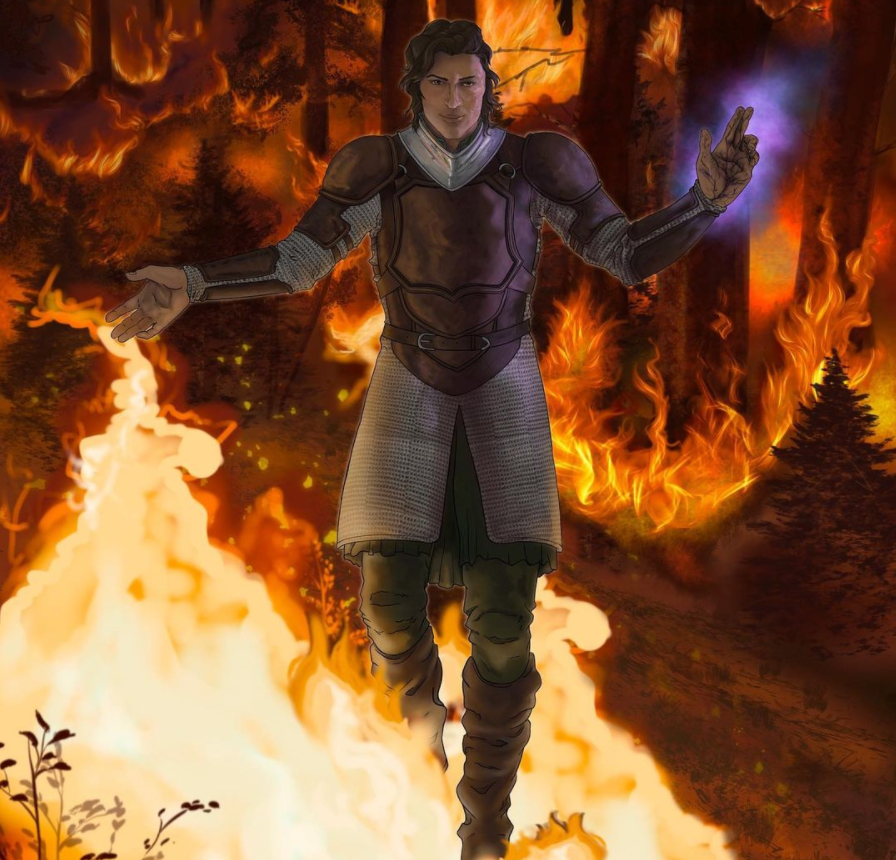
And from Jacob H

New from Craig Paton on deviant art

And from Gnaberius:

From KingVego

From DeriHarrow

From Danps

From Hugo Campos (draft)

Four from Guilherme Match - check out his portfolio HERE


This from Mike

And from Daniel

By BlackCrescents

By Miu-chii


By Black Crescents
Jorg and Miana

By Darkstar020
Jorg (& Gog)

By Luan Matheus

I'm afraid I've lost the attribution for this one - please tell me if you know.

And another for which I have lost the attribution (let me know if you know)

From ßruno Alcantara

From Zuko.


From Lauren Newburg


By Joe Primus.


Yes!
ReplyDeleteI hate it. I have no problems with characters on the cover, as long as I can't see their faces or other specific features. Best is if they are only seen in a distance.
I think it takes something away from me, because I want to make my own decision on how the characters look. Even if they are described in detail in the book it still leaves me room to dream. But a picture of the protagonist on the cover doesn't. I'll just disregard the cover in the end, thought sometimes I might not even look at books with such covers.
I'm not saying they are bad or anything (I've seen some really good ones) but I normally don't like them.
When I read fantasy I want to dream as much as possible. Even thought it's always the same story how we see it is different for every reader. Everyone creates his own world, and I want mine without anyone tampering with it beforehand.
I like the Jorgs created, but none of them is "my" Jorg, so I can't relate to them as much.
I've personally no problem with it. What the hell does it matter what characters fine details count against a good story? I'm not petty enough to let a cover showing it's prot. deter me from a potentially good read.Hell, I like the Wheel of Time Covers, I like Erikksons covers, and even Elmore's campy ones. I grew up with the heroes and villains showing on covers.
ReplyDeleteOn the other hand, I can't stand this trend of Hooded Characters on every damn Fantasy Book. It does nothing to separate the books from each other. I've actually stopped buying books with hooded characters because I'm tired of reading about the teenage male assassin character. With Assassin's Creed popular in the gaming world, I'm getting all Hooded Assassin'd out. Why don't more book covers feature landscapes or, an interesting room?
You know what would pull me to a cover? A very well detailed Wizard's Workshop, or A giant floating gateway that bristles with magical energy, while little figures below pass through to world's unknown.
Wouldn't that satisfy both camps, while getting rid of this stupid trend of the same hooded character on every cover?
I agree! I'd much more like to see the Magic McGuffin, or some other pivotal item or scenery than an actual protagonist. I already know what people look like, I can fill in the blanks well enough on my own from descriptions. Magic items, or stunning vistas, however, are harder to imagine because I have less practice with seeing those! For example, the US cover-art for Way of Kings is simply phenominal. (http://2.bp.blogspot.com/-b0MS9Z91sJo/TzxCoSyh8RI/AAAAAAAAAD8/v7dn05ReMgw/s1600/wayofkings_rev_lo.png) it fills in many of the images and themes that are otherwise not very easy to imagine.
DeleteTo me, the cover art is the eye-catcher. Any character portrayed on the front, I am not going to know it is the main character until I start reading the story. By that time, I am sure I have my own mental image from the text. The cover art, for me, has been a way to 'catch my eye' as sometimes, I troll the book racks, just picking out books that have some artwork that stand out to me.
ReplyDeleteTo me the protagonist or indeed antagonist is within the reader's own mind. Therefore any cover art containing such character's should have faces hidden or show them in the distance. I also think the hooded character on covers is widely used enough and other aspects of the world/story should be an integral part of the cover design. I did like the third Empire book cover, for although it shows, I assume Jorg Ancrath, he is facing the opposite direction. My image of him thus, is saved.
ReplyDeleteIf the book is good enough I lose sight of the picture on the cover soon enough. It's just the decoration that maybe attracted me to the book in the first place and what allows me to identify it when I want to pick it up again. Excellent pictures btw.
ReplyDeletehttp://www.peter-hodges.com/wp-content/uploads/2012/11/KingOfThorns.jpg
DeleteThat is Jorg to me.
I always ignore the cover assuming they've gotten it wrong, since they usually do. I compare it with my imagination after reading. Also, who is this short-haired man everyone keeps drawing? For the majority of the books, Jorg's hair is to his waist. he's always flipping it over his shoulder. why were these people imagining short hair?
ReplyDeleteWell, I love KingVego's Jorg.. the mischief is captured so darn well!!! :)
ReplyDeleteI don't mind. I usually don't even look at the cover that much while reading the book. I zone out of the world, and then when words start flowing I start imagining. When kindle came into my life, this became even more true. I sometimes search dA for the images, not to create my own, but to see what others think. I usually find inconsistencies, so I never take it like: THIS IS THEM. No, this is their interpretation of them.
ReplyDeleteWith your book being first-person it's even stronger. With Jorg I imagine a form of a character I created a long time ago, but changed. Because personality makes me feel this way. Like when you know an asshole in your life and the character in the book is an asshole, they're going to have some similar features. With Jalan, I remember my once best friend who hightailed out of my life when I needed him most because it wasn't convenient anymore for him to stick around. He hung around with his 'friends' that were more like drinking-buddies but then needed a favour to save his ass. Sort of like Jalan is first described as.
This comic describes my imagining of characters pretty well:
https://s-media-cache-ak0.pinimg.com/originals/a1/c7/e9/a1c7e9379c90c8d343254aace5b0cfd7.png
It depends. Some of these Jorg interpretations you've posted here are sexy and someone I want to know more about. Others are frightening. Yes, I realize Jorg is a dangerous man, but if the cover image is off-putting, why read the book? xo
ReplyDeleteI love art with fantasy, particularly character art. The art in the Dark Tower series helped me to really understand the world building.
ReplyDeleteIf you read Ilona Andrew's Innkeeper Chronicles (and you should), there are beautiful character portraits inside.
And sub press is making a business of adding art to books, and making higher quality tomes to collect.
It's all good.
If the cover follows the description of the character given in the book, I've no problem with it. But take Fitz, for example - he's described as having dark skin and hair, and most book covers depict him as light-skinned, some even with blonde hair. And because I'm usually really bad at remembering verbal descriptions, I base my visualizations to the cover images and often end up with false visualizations.
ReplyDeleteOh, and then there's the case od the Finnish Harry Potter covers. They style of the illustrations is very original, and personally I love it, but it made me imagine the characters as they're drawn in the covers. Not that it mattered much, but it was a bit disturbing at times.