I saw a recent post in the Fantasy-Faction Facebook group where a reader had found a hardback copy of Prince of Thorns in a charity shop. He was very happy, and deservedly so, since on ebay the same thing is this much!
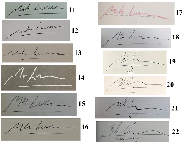
BUT ... he was worried, because the signature didn't look like the signature he'd seen online. Did he have a ~£300 signed copy, or a copy spoiled by some fraudster, and that might be worth as little as £15?To cut to the chase - it was real. My signature has ... simplified over the years. It appears to be heading towards a flat line.
I've blogged about this before, but here's a fuller accounting of the evolution. The biggest change came during the first few years. When you're signing 300 signatures, and later 500, or even a 1,000 in one batch ... you rapidly come to the conclusion that letters are really an optional extra, and if the line wiggles vaguely in the direction of them, that's fine, people will work it out.
Here's an example of my signature from every year, starting at 2011 and reaching 2022.
And a more detailed take on how it looked by 2014:
So, there you have it. Not the best of signatures, not the worst, but it's mine and I'm owning it. And, apparently, owning it can make you a little richer!


I knew a man whose signature was a vaguely tick-shaped line with a dot above it. Nice and simple for him - and also for his kids, should they need to forge his signature on something.
ReplyDelete