The public vote is of course a bit of fun and subject to all the issues of brigading and cheating that online polls often are - though our anti-cheat software is more effective than the raw poll results might lead you to believe.
We did this in 2018, 2017 & 2016 too.
Interestingly the 2nd place cover in the public vote got no votes from the blogs. And the 3rd placed cover in the blogger poll came 20th in the public vote!
WINNERS OF THE BLOGGER POLL
Gold Medal (8 votes)
Artist: Felix Ortiz. Designer: Shawn King.
Silver Medal (4 votes)
Artist: Mon Macairap. Design by Streetlight Graphics.
Bronze Medal (4 votes)
Artist: Jenny Zemanek.
WINNERS OF THE PUBLIC POLL
Gold Medal (167 votes)
Artist: Mon Macairap. Design by Streetlight Graphics.
Silver Medal (137 votes)
Bronze Medal (133 votes)
Artist: Felix Ortiz. Designer: Shawn King.
Covers with 100+ votes (in order) - 7 votes separated these 5 covers!
Here are the finalists from the blogs:
Fantasy-Faction


I would love to know what the author's thoughts were on their cover designs. What specific instructions did they give to the illustrators? What are the meanings behind the imagery? What emotions are they hoping to evoke from potential readers? Things like that.
ReplyDeleteAllow me.
DeleteFor Rocks Fall. Everyone Dies, I wanted an image that evoked a sense of peril, awesomeness and adventure but had absolutely nothing to do with the contents of the book.* As the story is in its essence a parody of D&D and Fantasy fiction I wanted to start the humour right from the cover but without making it something silly. Fantasy fiction covers are AWESOME, and I thought mine should be too.
*Hence the asterisk * Literally no dragons in this book
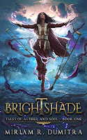
It sounds like my process for Brightshade was similar to that of Author Guy over here.
DeleteMy artist and I worked towards a cover that didn't necessarily depict a specific moment, but that perfectly expressed genre, tone, and character. Since my main character is a POC who gets around with the help of either her horse or a pair of crutches, the other imperative part was making sure she didn't get whitewashed or have her disability erased. (I also had to request her crutches be repainted to look more medieval/old/fantasy-like.)
Hey Sybrina. I created my own cover for The Wretched. The story is inspired by the fantasy I grew up with--books like the Wheel of Time and Raymond E Feist's The Magician. When I was younger I would spend hours staring at those covers painted by the great Darrell K Sweet, and they would stir up all kinds of emotions inside of me. One of my favorites was "The Shadow rising," book 4 of The Wheel of time, that showed a group of young people sitting outside a wagon, around a campfire. Modern books seem to have shifted away from those kinds of scenes to scenes that are more exciting and immediate, and while I love, and possibly even prefer the new covers, I wanted mine to be a tribute to the fantasy that will always hold a special place in my heart. My book is as much a journey of self-discovery for the characters as it is an adventure, and I wanted to capture some of that in the artwork. Also, for marketing reasons. I wanted people to know that it was noblebright fantasy, so I wanted to focus on the beauty of the world, and steer away from war and battle hardened warriors clutching bloodied swords.
DeleteFunny that the leading cover has review by Mark Lawrence on the front cover!!!!
ReplyDelete